By Jillian Wong, 01 Apr 2014
COMMENT SHARE Share on Facebook Twitter
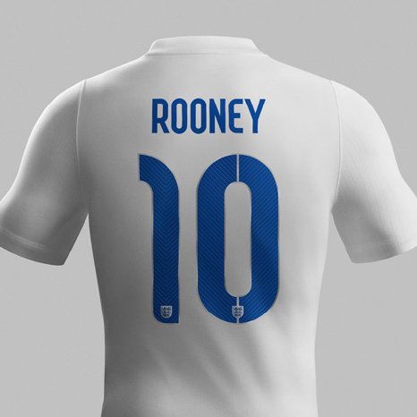
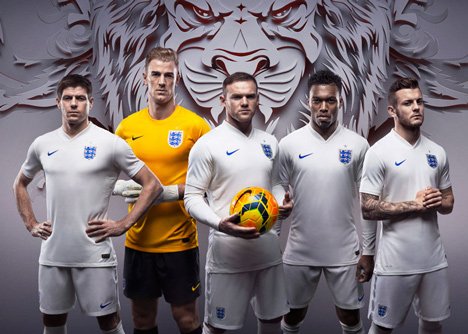
British graphic designer Neville Brody has designed a typeface for the 2014 football kit that will be worn by England’s football team at the World Cup in Brazil in June.
He was approached by Nike, the designers of the football kit, to create a typeface for the names and numbers for each of the players.
The curved dark blue typeface for the all-white home kit features a subtle, diagonal pinstripe in a darker shade of blue for texture. The san-serif font has a tall, narrow silhouette and tight spacing, and the back of the shirt incorporates England’s three lions logo into the player’s stencil-style numbers.
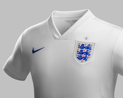
The England badge has a silver metallic weave around it and a single star to symbolize England’s sole World Cup win in 1966. Satin tape on the shoulder seams create a shimmering effect and further accentuate the outfit.
“The core inspiration was to focus on the intersection between flair and workmanlike reliability. The industrialized suggestion of a stencil was simultaneously based on a pinstripe motif, combining style with a no-frills efficiency,” the designer explained.
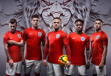
The red away kit has a round collar instead of a V-neck and a white typeface on the back. According to Nike, it also features an optical illusion of St George’s Cross which can only be seen from a distance.
The new home kit will debut at the friendly with Peru at Wembley Stadium on 30 May.
